     Using data graphics might be a direct and effective way to present information, yet it comes along with many issues.
     Jeff Leek at Simply Statistics has a great post that explains how Fox News presents data in a really tricky way, to
     change how the information is interpreted, with all the data fact-grounded.

  Here are some tricks Fox News play:
 (via Truncating the y-axis)
  1.
  The above graph shows a common way to "lie" with fact-based statistics by truncating the y-axis.
  With the y-axis starting from 34%, the gap between the two top tax rates (before and after the Tax
  Cuts expire) is exaggerated. It is easy for manipulators to lead information in this way, without
  making up false numbers, yet it is sometimes difficult to be noticed by the viewers.
 (via Percentages that don't add up to one)
  2.
  This trick is usually adopted to allow multiple choices to have closer percentages than they probably
  should. It could be misleading when the audience simply focus on the precentages, paying no attention
  to whether they round up to one. In this example,the precentages of "Somewhat likely" and "very likely"
  add up to 94%, which might not be the fact from the original poll.
 (via Using the wrong kind of chart)
  3.
  Also in this case, it is suggested that multiple options are all equally likely by using a pie chart
  where the precentages of components do not add up to one.
 (via Not Labelling the axes)
  4.
  This data graph is an example of "not labelling the axes", achieved by changing the units of comparison.
  It is actually stating the comparison between total spending for 2010-2013 and deficits in 2008, while
  the units of data remain unclarified.
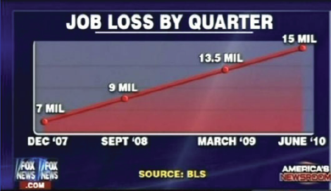
 (via Sub-Sampling x-axis value)
  5.
  In this last case, the upper graph shows unemployment rates increasing steadily over time by sub-sampling
  x-axis values. The graph below shows the trend when consistent data are picked, compared with the previous
  one, indicating a more realistic trend of job loss.
  Efforts that the Fox News put on leading information with data graphics could be seen from example above.
  Yet in fact, Fox news is not the only organization using the data tricks to make their points. No matter
  you are in favor of a specific news organization or not, the viewers should bear in mind that data graphics
  are in some cases serving to express the organization's point of view. For viewers, they should be aware of
  some basic elements of a graph, namely the titles, units, xy-axes and different features of different kind
  of chart. Further, if one is doubtful about the credibility of the data, he or she should not feel troubled
  looking for the original data and do should do the fact-check. Some useful methods to spot data spins and
  misuse are provided in the file with the link attached below.
Further readings: Statistical literacy guide - How to spot spin and inappropriate use of statistics (click to download pdf)